The Challenge
We worked with Pacific Breeze Holdings, a newer Custom Home Building company based on Vancouver Island, to update their brand identity in a way that better suited their needs and communicated their connection to the industry with their prospective clients.
Starting from the ground up, we first asked the client for pertinent information about their vision for the brand update using predetermined questions, and reviewing their current brand for inspiration and getting a better understanding of how we could elevate it.
The client then provided their requirements, and shared ideas for their vision. The Pacific Breeze Holdings team communicated with us that they were looking for a logo that included their initials, the full “Pacific Breeze Holdings Ltd” name, and showcased their coastal roots in a Main logo, supporting monogram, and Icon for multiple uses. This also included some inspirational photos to give us context on what they were looking for style-wise, and give us an idea of how to proceed.
The Solution
Using the information the client provided and the inspiration photos for their rebrand vision, our design team got to work by first reviewing real-life branding applications from the client’s competitors on Vancouver Island and the Lower Mainland to determine what kinds of branding styles are saturating the industry already, and what could be implemented into the PBH rebrand to stand out from the rest.
Then the design team spent time considering logo inspiration for the new branding using a broader online search to come up with ideas for logo elements in the first inspiration and sketching stage. The design team sketched an unlimited number of logo ideas to cover the bases, before choosing the best three options to be brought into Adobe Illustrator to be digitized once they have come up with the best possible solutions.
The design team determined that to showcase the best possible options to the Pacific Breeze Holding team, option one would include Breeze/Clouds/Coastal themes, option two would include a more sophisticated, fancy typeface in a wordmark style, and option three would include block lettering and some kind of nod to a house icon. This would allow the client to get the broadest options to narrow down what they like for the initial revisions and get an idea for the different directions this rebrand could lead to.
Once the three options were brought into Adobe Illustrator and cleaned up and adjusted, the design team brought in fonts and colours for consideration for each option. These fonts and colours were all recommended based on the personality and tone of voice the client was trying to portray, offering the best representation of their brand for prospective clients.
Once all three options were cleaned up, coloured, and font applied, our Design team brought them into InDesign where they were formatted and displayed in our Re-Brand guide. This guide was then sent off to the client for further revisions before the final logo identity was decided on.
Each of our rebrand projects includes three initial logo options, as well as three revisions after the first initial proposal to determine which logo we will proceed forward with, and make any adjustments to the final design before export.
The Results
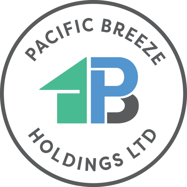
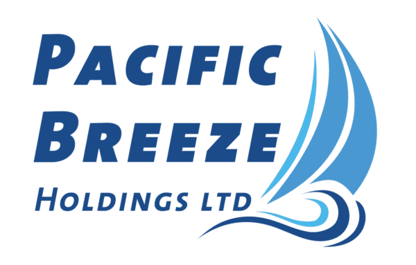
The final brand identity resulted in a beautiful crest identity that played on the shapes of the “P” and “B” of Pacific Breeze in a way that created a unique icon and crest that is different from most competitors. This solution also leaned more on communicating Custom Home Building with the Home cutout that is included throughout, which gives their prospective and current customers a better idea of what they do. The colour palette and font also communicate their home building industry ties, as well as coastal location.
Before
After
![]()